
The Mozilla Foundation has released the first alpha release of what will become Firefox 1.1. To prevent confusion of Firefox 1.0.x users, they have gone to great lengths to make sure only developers and testers download it. Among them are calling the release by its codename (Deer Park), changing the product name for the developer release, and even changing the icon. Instead of the Firefox “humping a globe“, it’s just a globe. Kind of apropos, seeing as it isn’t a finished product.
Very soon after installing Deer Park builds, I found that I prefer the Deer Park logo.
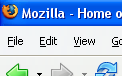
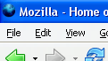
Here are some comparison shots:
| Firefox 1.0.x | Deer Park |
 |
 |
 |
 |
 |
 |
I prefer the Deer Park logo because:
– it is more simple. That image is easier to remember, and easier to redraw.
– I can’t think of a better symbol for a web browser than a globe. A always loved how the old Netscape throbber inspired my imagination about what could be done with the product and the technology. The Firefox icon contains more fox than globe.
The Mozilla Foundation has an animal theme going, which is good for identity and association of all Mozilla products, but the Firefox icon doesn’t really communicate what the product does.
I prefer the globe.

I dunno, I like the regular Firefox logo. Just a globe isn’t interesting…
I have to agree with Peng. I actually really like the Firefox logo, and I’m telling Jon Hicks you don’t like it 😛
could have a smaller, slimmer fox jumping over the globe “The quick
brown fox jumped over the lazy dog.”
This ratio of colors (bl & orange), but the fox skimming over the top: http://zombi.excelnet.ro/muzbiologie/romanian/images/globe%201.gif
Blue globe blends TOO well into the blue title bar, IMO.